The things that annoy you about Postmark
Last week Chris wrote a blog post about The Little Survey That Could. We asked our customers one simple question: “What annoys you about Postmark?” The results have been… well, I’m just going to let Chris tell you about it:
The response has been incredible. This was a one-question survey. It didn't ask about onboarding, or target a certain group of users. Instead, we asked a single leading question knowing that we must have those little annoying parts that wear people out every time they use our product.Subscribe to be notified about future survey results.
The responses that came back brought a huge smile to our faces. It wasn’t the quantity of responses, it was the granularity of the responses. While some of the things are known, we uncovered a list of small but valuable changes we can make to improve the daily experience for customers. And while they seem like little annoyances, they are actually giant inconveniences. Things like organizing the servers page, or searching sender domains. Solving each one can have just as much impact as the next big thing, and we plan to do just that.
Overall 81 people responded, and we want to let you know what the biggest annoyances were (and what we plan to do about them). There were a few one-off things as well, but in this post I’ll focus on the things that came up more than once (don’t worry, we’re working on some of those one-off things as well!). So here they are, in order of frequency… the things that annoy you most about Postmark.
Sender Signature search #
We always knew the ability to search the sender signatures page was an important feature, but I don’t think we realized how annoying it is to our customers — especially if you send from a bunch of addresses. This was by far the most frequently mentioned annoyance. Luckily we were right in the middle of working on this feature when the survey went out. So this one is easy: sender signature search is now available! You can read the announcement blog post here.
Server page design and organization #
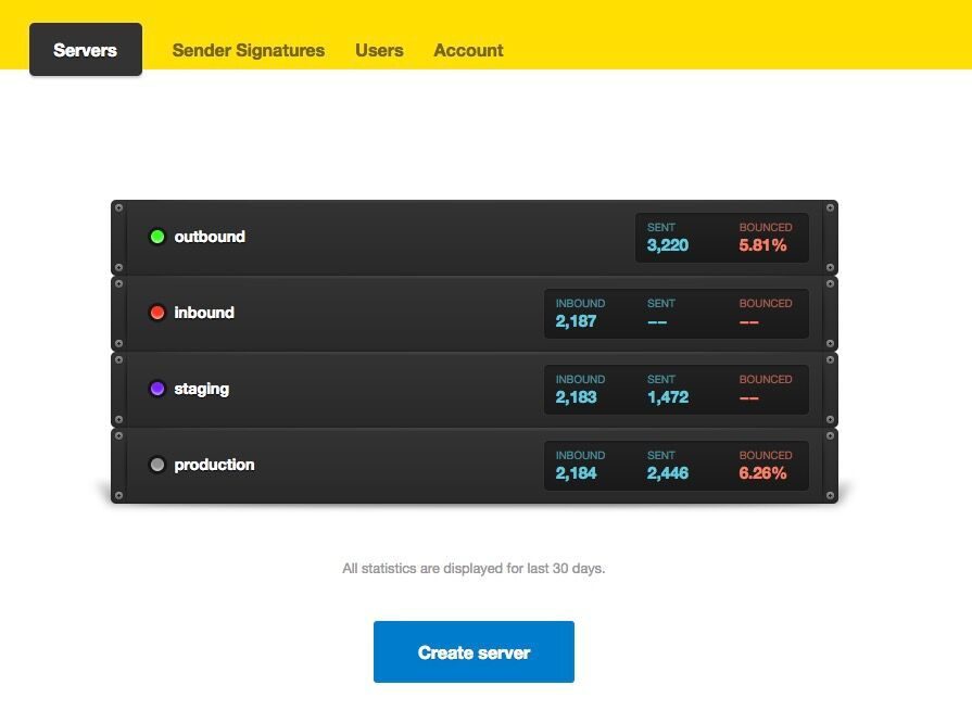
This one wasn’t really on our radar until we sent out the survey. Quite a few people mentioned that the main Servers page needs some work.

You asked for a few things in particular: the ability to sort servers, drag and drop them into a manual order, switching to a more compact view, and showing a bit more information (such as spam complaint percentage). Those are all good ideas, so we’re already exploring some ways to improve it.
Spam complaint reactivation #
A few of you mentioned that it’s really annoying to have to email us to reactive an address that one of your customers mistakenly marked as spam. This is a tricky one… we can’t allow you to reactive any address that gets marked as spam, because that would defeat the purpose. In the vast majority of cases, if one of your customers marks a message as spam, it really does mean that they don’t want to hear from you. In those cases it’s important to make sure your customers expect your emails, and that the content is relevant to them.
That said, we’ve been discussing this and there are some things we could do to improve the spam address reactivation process for you. We have ideas but no definitive plans yet — we’ll keep you posted.
Improvements to the Activity page #
Towards the end of last year we released a brand new Activity page. Overall the response has been extremely positive, but we knew we weren’t done yet — there are still things we want to improve about it. And the survey confirmed that for us, as quite a few of you brought up improvements you’d like to see. This includes things like remembering your last filter, adding additional filters, and searching by content. The good news is that we have plans and solutions for most of these issues (and more).
Customize Sender Signature email #
For those of you who send email on behalf of your customers, we often get requests to allow you to customize the “confirm sender signature” emails that go out to those customers. You’d like to include some branding or a personal message so that your customers aren’t confused when they get an automated email from Postmark instead of from you. This came out quite a few times in the survey, and it’s another feature that is already on our roadmap.
Mobile app #
This is another one that made us smile… A few of you asked for a mobile app so that you can manage email issues on the go. Well, you’re in luck! We started our year with a 2-week “Hack Week” stretch, and Matt decided to build an iOS app as his hack week project. It’s currently in beta testing, and if you’d like to help us test it, you can sign up here.
In closing I want to mention again that this was a really invigorating and enlightening experience for us. It went from idea to execution in one hour, and the usefulness of the feedback we received way overshadowed the time it took to make it happen. So on a side note, we’d love for other companies to try this too, and let us know how it goes for you. Maybe we can start a trend. 🙂
If you have any other feedback or annoyances you’d like to share, please get in touch with us at support@postmarkapp.com.


