How to design an effective welcome email
The welcome email is a key part of a customer’s first interaction with your product. They’ve just created an account and are working to get set up and verify your product meets their needs. It’s a great opportunity to provide customers with useful information that helps them explore your product.
We’ve written extensively about what makes a great welcome email in the past. In this post, we’re going to look at some examples from popular products to inspire you to create effective welcome emails of your own.
The welcome email is a key part of a customer’s first interaction with your product. Getting it right is critical.
Slack #
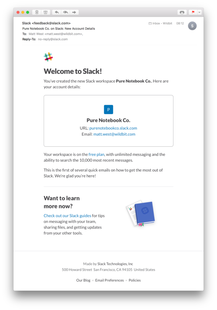
Slack’s welcome email does a great job of providing you with an overview of all your account details. Each team in Slack has a subdomain which is used to access the product, so including the URL here is a great move. The email also has a reminder of which plan you are on, with a quick summary of what that plan includes.
There’s a clear callout for Slack’s guides to help new customers get the most out of the product.
The main pitfall of this email is there’s no information on how to contact support if you have a question or need some help getting set up. Even the Reply-To address is a no-reply email address. Simply updating this to a support address would give users a quick way of getting help if they need it.
Harvest #
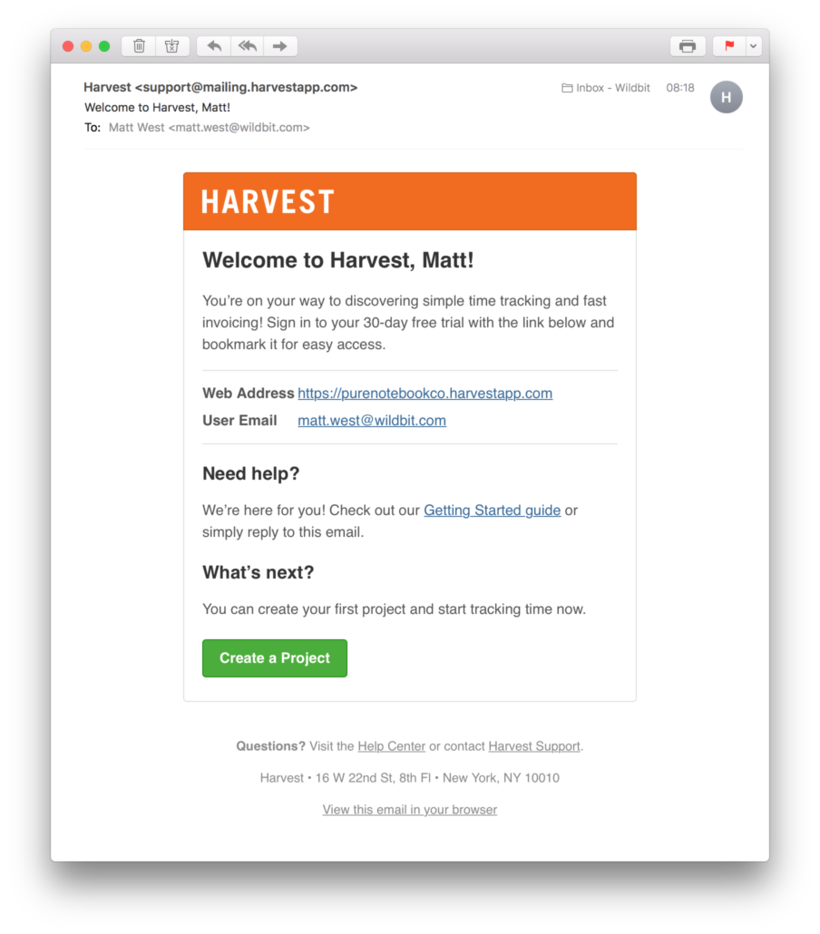
Harvest’s welcome email is a great example of how to provide a wealth of useful information in a short and concise format. This email includes all your important account information, links to helpful resources, and a clear call to action that links the customer back into the onboarding flow.
Replies go straight to the Harvest support team, making it easy for customers to quickly ask any questions they have.
Basecamp #
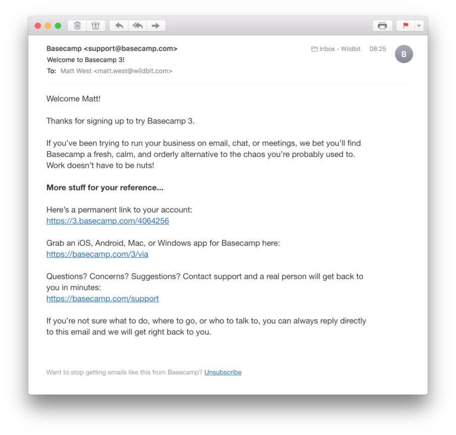
Basecamp’s welcome email is also simple and to-the-point. I love how the opening paragraph re-iterates Basecamp’s mission in a way that’s relatable to the customer. As with the other examples we’ve looked at so far, there’s a link to your account and some info on how to get help should you need it. Note that replies also go to the support team.
One thing missing here is a clear next step action. Basecamp has a great collection of getting started videos on their Learn page which would be a good resource to highlight in the welcome email.
FreeAgent #
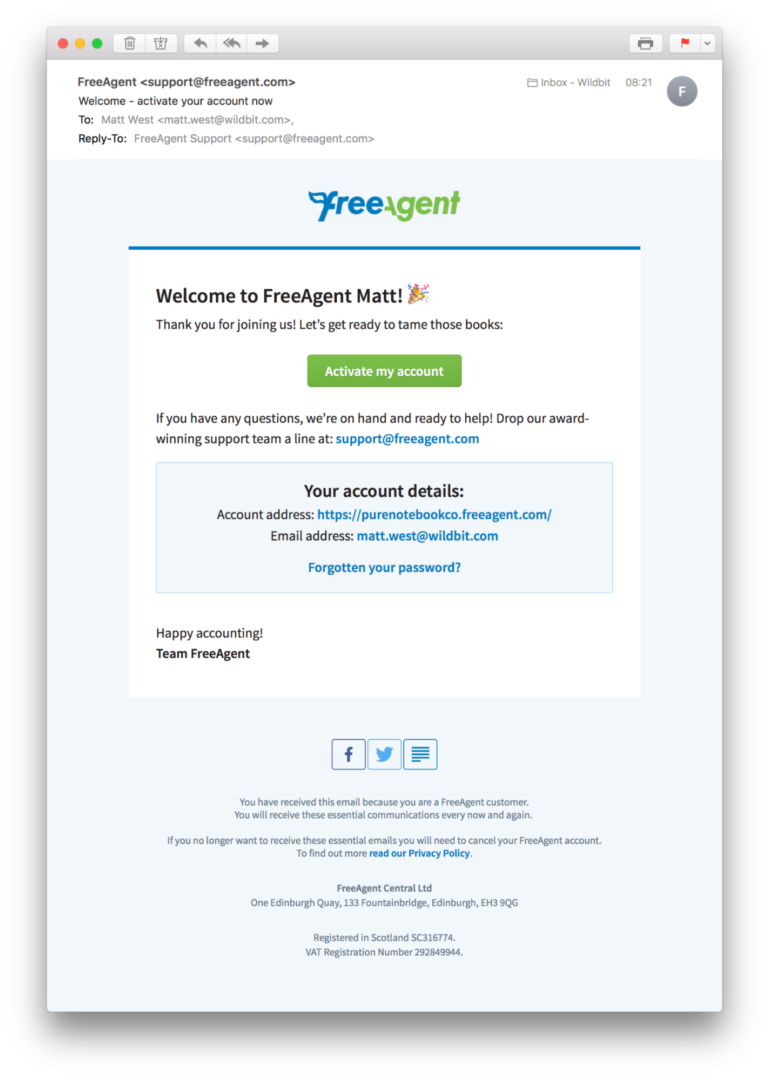
FreeAgent sends out two different emails during the sign-up process. The first includes a summary of your account details and a prompt to confirm your email address and activate your account.
It’s pretty standard to see activation links in welcome emails. Sometimes it’s necessary to help limit fraudulent signups, but there are other ways of validating that emails are correct. For example, many email providers have webhooks that can notify your application if an email bounces, which is a great way of doing passive email confirmation. If your app receives a bounce notification, you can mark the email as broken in your database and show the customer a prompt to update their email address next time they access your app.
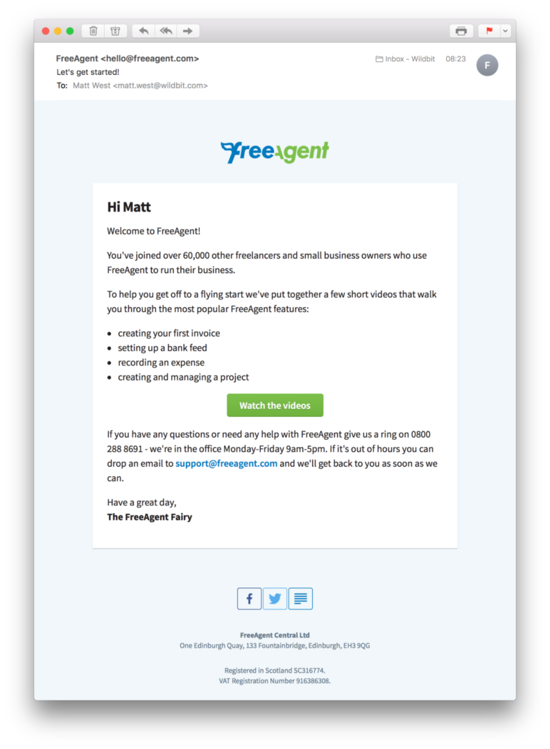
FreeAgent’s main welcome email contains a clear next step action to view their collection of getting started videos. This email also includes more detailed information on how to get support.
You should generally avoid sending more than one welcome email. Sending a bunch of different emails in a short amount of time can overwhelm customers which is a surefire way to lower your engagement rates.
That said, in FreeAgent’s case sending two emails is okay. Each email has an obvious call-to-action, and combining all the content into a single email may become overwhelming in itself.
Headspace #
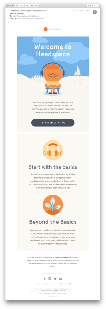
Headspace’s welcome email starts with a reminder of the benefits customers can expect from using the product. It includes beautiful visuals that set a calm and approachable tone. A clear call-to-action prompts customers to get back into the app and try the product.
The email also includes a quick overview of the journey a customer can expect to take with Headspace. Starting with some basic techniques and then moving on to broader topics. It helps set expectations and combat any anxiety the customer might have about trying something new.
There are also pointers on where to get help, and responses to the Reply-To address go directly to the support team.
Summary #
In this post, we’ve looked at examples of welcome emails from five different products. Here are some of the common themes we observed:
- Friendly copy that reiterates the benefits of using the product
- Clear call-to-actions that prompt customers to engage with the product
- Important account details like login URLs, email addresses, and subscription plans
- Resources to help customers get started with the product
- Reply-To addresses that go to customer support
- Links and phone numbers to contact support
Learn more about designing great welcome emails #
Now that you’re feeling inspired, here are some more resources to help you build great welcome emails for your applications.
Create stunning welcome emails with Postmark
Start with one of our responsive, well tested, and customizable templates or code your own from scratch.


